Nexsys Clear HOI Brochure
Nexsys began developing a product in late 2017/early 2018 in the homeowner’s insurance space. During the summer of 2018, their product manager and leaders requested that we put together a brochure to promote their upcoming product at future trade shows.
Easy enough, right? By that point, Nexsys’ visual brand was on solid footing, and it wasn’t exactly our first rodeo. We’d go with the usual effects: spot glosses and soft touch laminate to hit that tactile contrast we love so much.
The challenge here, however, was that the product, and therefore the brochure, had two separate target audiences and we were only approved for one brochure. Sure, it’s not like they’re from two different worlds – they offer adjacent services within the same industry. The product offered separate benefits to the two audiences, but each needed to be represented equally. I could have done something similar to the Infinite Accordion Fold we’d done a while back, but the content didn’t seem to be a good fit, or the format suitable for use at a trade show.
Instead, I opted for what was essentially a reverse trifold brochure (reverse in the sense that the far right panel folded over the other two and served as the cover).
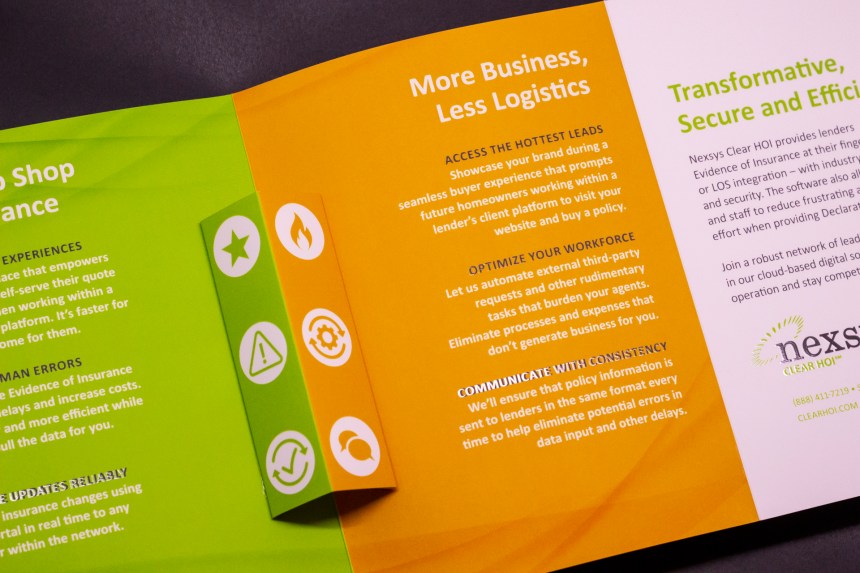
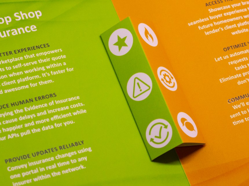
To separate the two sets of information, I took some inspiration from a series of Faygo billboards I had seen repeatedly on my commute to and from work. Each used a strong monochrome color scheme that was tied to a flavor of Faygo – purple for grape, green for lemon lime, and orange for … orange. For obvious reasons, the latter two are what sparked the idea for the layout.
I’ve typically avoided using Nexsys’ primary green and orange in equal amounts within the same layout; one usually acts as an accent to the other, and they’re almost always separate by a white or gray buffer. The contrast when they’re up against each other is too harsh. However, that’s exactly what I wanted in this case. The harsh contrast between the green and orange would provide the visual separation between the two sets of content.


The brochure measures 15×7″ and folds down to 5×7″. It features a circular die cut on the far right panel/cover, and narrow pop-up panel that straddles the fold between the left two panels. On the pop-up are icons that correspond to the benefit listed next to each on their respective sides. Each icon, along with their respective benefit’s subhead, are treated with a spot UV gloss. The main headers and each logo is treated with a spot UV gloss as well, and the rest of the print is treated with a soft touch laminate to add a matte finish to contrast with the spot gloss.
Project copywriter: Devin Turner
Printed by Behrmann Printing
