“Infinite” Accordion Fold


The “infinite” accordion fold is a print piece we produced for our QLMS support team. They were then given to our associates over at QLMS, who then distributed them to their account executives. It was intended to act as a reference piece for any account executives with partners who were interested in using Title Source. The content provided counterpoints to reasons we had heard from those not interested in using Title Source.
The initial idea was a brochure with interior pockets and inserts, which would’ve worked fine, but we were concerned that the size might discourage AEs from having it in their possession when they’re most likely to need it. With that in mind, it needed to be compact, very compact.
So how could we create something with a small enough profile to fit in a pocket, but not sacrifice the space we needed for the complete content?
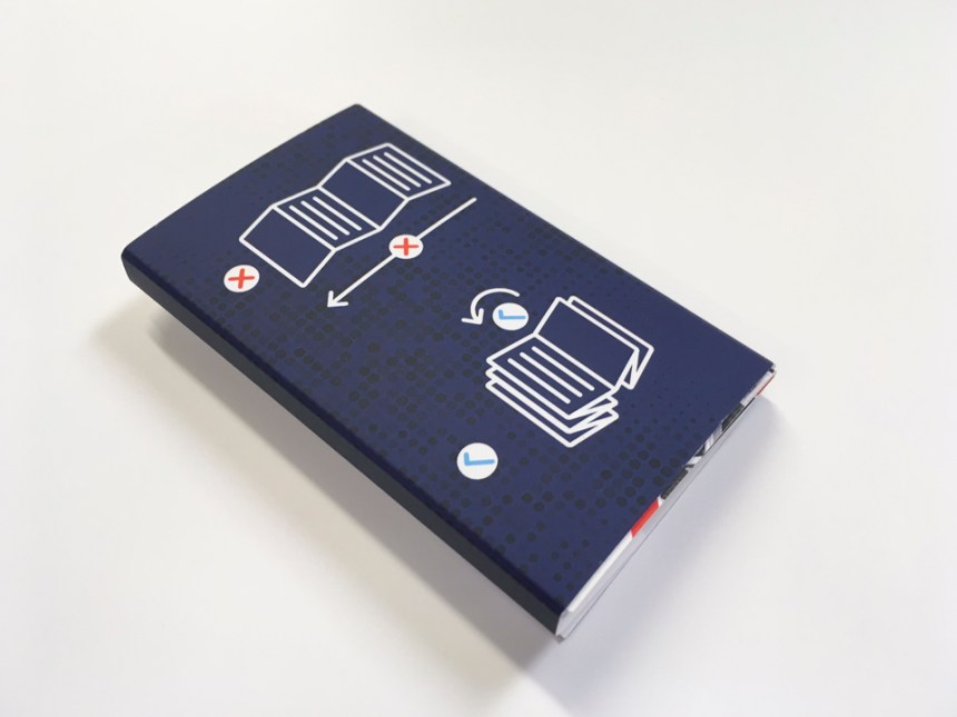
The answer was a 10-panel accordion brochure that would fold down to standard US business card size, 3.5×2 inches.

The accordion fold gave us the space and size we needed, but what about the backside of the brochure? Would it just be a long span of decorative elements to take up all the excess space we’d created?
Not exactly.
Lucky for me, Devin had developed a series of six talking points we’d been touching on in most of our pieces for the QLMS team. Add in a short introduction, some closing comments and contact information, and we had just enough content to fill out the backside of the brochure.


So where does the “infinite” part come in?
The brochure is vertical – if the reader handles the brochure as intended, by paging through instead of expanding it all at once, flipping the final panel on either side would land the reader on the cover page of the opposite side. It’s like a mobius strip in brochure form. Just in case, I included some Ikea-style directions on the backside of the brochure’s cover wrap.
We printed the initial run on cover stock white Plike, but weren’t satisfied with the feel of it in areas of the design with heavy ink coverage. The piece was a hit with the account executive regardless, and on the second print run we used a generic cover stock with soft-touch lamination applied.
The second run yielded a better result, and with a negligible price difference.
In case I’m not explaining it well, here’s a video:
Project copywriter: Devin Turner
Printed by Behrmann Printing
