Nexsys Brand and Website Update
Long story short: we made some long-overdue updates to the Nexsys brand, then completed a full rebuild of their website.

I got a chance to redo a previous project, and then some.
Nexsys’ original visual brand was developed organically, which I guess is a nice way of saying it was done ad hoc. There were good parts, but it had some problematic elements, as well as lacking in consistency.
So what all did we do? The ultimate goal of the project was a new website, but there were several milestones and assets we would need to deliver before beginning the site.
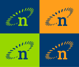
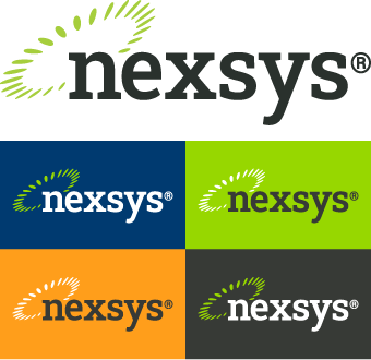
New Color Palette
Problem: Nexsys’ color palette was too bright and made accessible color pairings nearly impossible.
Challenge: retain the vibrance of the primary colors.
Solution: add a dark color to the primary palette to offset the citrus theme.
I’m simplifying for the sake of brevity, but it’s amazing how much of a difference was made adding a blue to the primary colors. By adding PANTONE 654 C, not only could we utilize white background layouts, but we had a color with sufficient contrast to our primary green and primary orange that we can use them for text by pairing them with the new blue.
Updated Logos
Problem(s): the wordmark of the Nexsys logo had three issues:
- The typeface didn’t appear anywhere else in the brand.
- The typeface looked dated.
- It was difficult to accommodate product variants.
So we’re two for three on typeface-related problems, making the following pretty obvious…
Solution: change the typeface.
The thing the old Nexsys logo had going for it was a strong lettermark. I was asked to experiment with replacing it, but it wasn’t long before we determined that changing one of the few elements of the brand that had some staying power wasn’t in our best interest.
I’m not going to lie and say there was some complex methodology for choosing the typeface for updating the wordmark: I like slab serifs. They’re timeless, yet contemporary. They’re bold, but not overwhelming. And best of all, we’d already chosen Roboto Slab to use as our heading font.
It was a no-brainer.
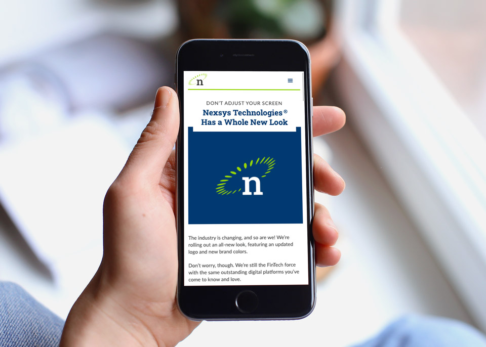
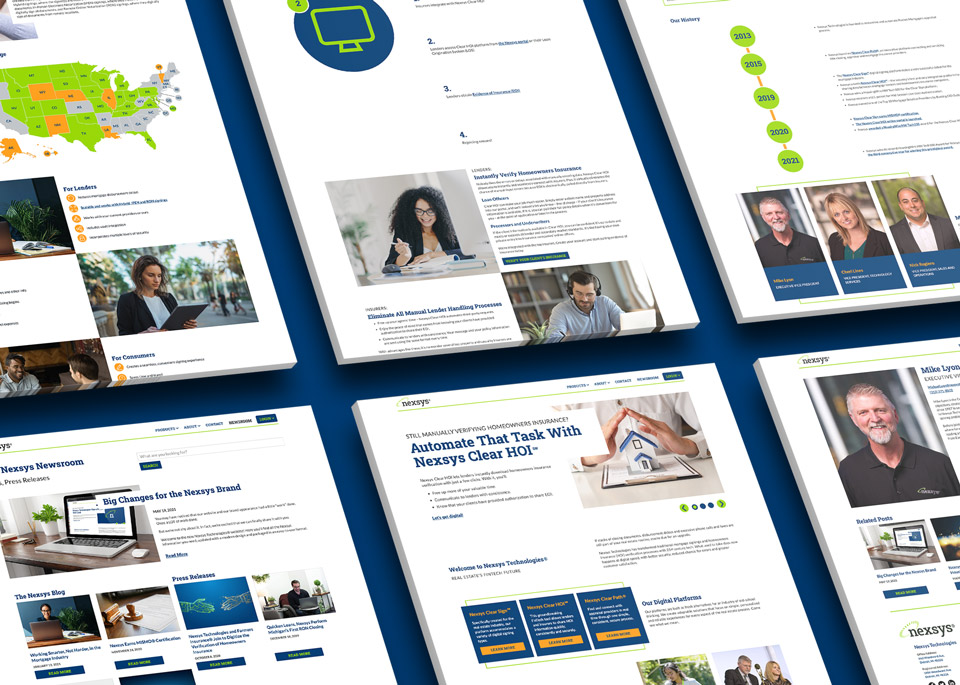
Updated Website
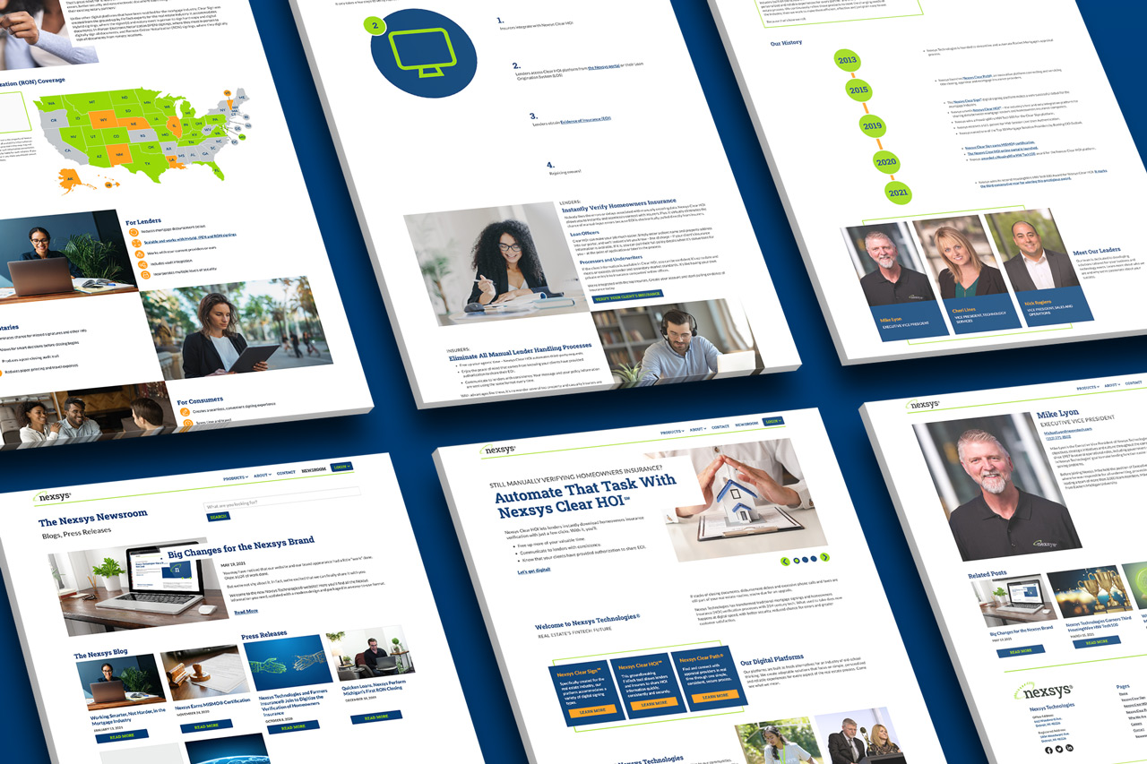
Before I dazzle you with a bunch of images of the new site mocked up on unbranded Macbooks in an ultra contemporary workspace, you can check out the site here: NexsysTech.com.
Problem(s): many.
Solution: do the opposite, basically.
With the earlier stages of the project serving as building blocks, the process of building the new website was straightforward.