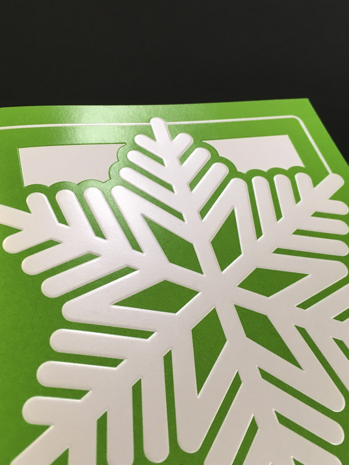
2019: The Diorama Brochure
Size: 4-panel, 5×7″
Style: Diorama
Effects: Tiered, die-cut inserts
Production: ArborOakland
I was able to get a head start on this year’s holiday card. Learning from previous years, I decided to develop three concepts that varied by price point, then propose each to our business stakeholders. We essentially had a preferred option, a backup in case the preferred option quoted out too high, and then a backup to the backup in case even that option quoted out high. Each concept was approved, and I was off to the races.
After meeting with a several vendors, we landed on ArborOakland with our preferred concept.
With this card, I wanted something that the recipients would want to hold onto. Sure, finishes like foils and spot glosses are great, but they’re common enough that a disengaged recipient might still toss the card after giving it a quick glance. I needed to make something that would live on peoples’ desks throughout the holiday season. It needed to be as much a decoration as a friendly greeting.


I got the idea from a Mother’s Day card my sister bought for my mom. It was a four panel card that acted as sort of a diorama. I loved the idea, and so did our business stakeholders. To add to that, we’d need our card to fold down to a standard size to avoid increased shipping fees, so there was that issue to fend with. After staring at the card my mom received for what felt like days, I was able to get a feel for what the die lines and how the file would need to be set up.
From there, I found a vector of a winter scene that was similar to the original mockup I pitched to the business, sliced it up in Illustrator and modified it to oblivion to fit my needs. At this point, the project felt more like I was engineering something than designing a greeting card.
It was worth it though. Print production went off without a hitch, and it’s probably my best holiday card to date.
2016: Metallic Foils … Everywhere
I had the pleasure of designing the holiday card for Nexsys in 2015. In addition to that, the strategist for our marketing team’s commercial channel approached me about designing the National Commercial team’s holiday cards for their clients. Here’s more or less how the conversation went:
Strategist: “Any chance you have the bandwidth to put together the holiday cards for National Commercial? They need one for December, and also New Years.”
Me: “Sure. What are we thinking for the budget?”
Strategist: “Well, they’re for external clients, so we want something high-end. We only need a small quantity, so don’t worry about the budg …”
Me (interrupting): “Yes. I’ll do it, and I already have some ideas.”


National Commercial Holiday Card
Maybe it’s just me, but when I get my hands on something that’s printed on a textured heavyweight stock of uncoated paper, it just feels higher quality than its coated counterparts. There’s this classic feel to it that I have difficulty explaining.
But that’s enough gushing about paper, let’s get to the details of the job.
A designer on our team several years back had produced some print pieces on a stock similar to what I described above. The design was simple, but the choice of paper gave it an elegant feel that put it over the top. The weight allowed for a subtle letterpress effect to be applied, and I fell in love with the piece.
I wanted to do something similar.
The designer who had worked on it left the company several years ago, so I reached out to our printer, Behrmann Printing, and they were able to track down a sample of the paper we had used on that job: Cranes Lettra. I was warned that it was a pricey sheet of paper, but the budget wasn’t an issue. I got buy-in for the paper from the commercial team, so I started on designing the card.
The design needed to acknowledge the holiday season, but not any particular holiday so as to appeal to a broad audience. Santa? No. Reindeer? Absolutely not.
I landed on snowflakes.
The cover would feature a cluster of small snowflakes surrounding a central, larger flake that would be treated with a metallic blue foil. The remaining smaller flakes would be hit with a glossy pearlescent white foil. Both kinds of snowflakes would receive a slight deboss via letterpress.
When light hit the card, the foils made it glimmer.

Nexsys Holiday Card
I had recently gotten back from my second Adobe MAX conference, where I had learned of specialty business card vendors like MOO and Silkcards. Among the dozens of samples I’d brought home, one thing that intrigued me were the ones using laser cuts and multiple sheets of paper to achieve a deep layered look. It was great – I could use that treatment to achieve a diorama-like winter scene.
Only I couldn’t. When consulting the printer, I discovered the process wasn’t cost efficient, and there was a chance the laser cutting could singe the edges of the paper. With this limitation in mind, the winter scene design I was considering no longer seemed worth pursuing; if we couldn’t do it right, we weren’t going to do it.
We could simulate the layered look, however, and I don’t mean digitally through drop shadows and the like. We were able to create multiple “layers” by using both embossing and debossing. It didn’t quite capture the depth we were originally looking for, but it was definitely an adequate substitute that landed within our budget. (We had a budget for the Nexsys cards)
Add a pearlescent finish to the cover, and we had ourselves a fantastic final product.
National Commercial New Years Card
To be honest, the final card was kind of easy. New Years has plenty of associated imagery and visuals that aren’t tied to any particular culture or faith, so it provided some freedom when figuring out the design.
Champagne? Fireworks? That has metallic foils written all over it. We coated everything else with a matte finish just to emphasize the shine on the foils.

Project copywriter: Devin Turner
Printed by Behrmann Printing
