“We want a brochure, but we want something unique that our clients will remember”
I’m paraphrasing, but that’s more or less what one of the account executives on our sales team told me during a strategy session in mid 2017. I went to the drawing board, did some googling, threw together some mockups, and …
this isn’t actually the brochure.
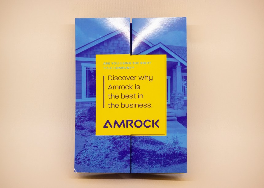
The original brochure I designed was a Title Source-branded, 5×7″ inverted wallet fold on 32pt Plike stock. It was nice in it’s own right, but the updated version I made after the Amrock rebrand is better.
So we rebranded, and one of the many painstaking tasks we had in front of us was revisiting all of our previous work (that was still relevant) and updating it to reflect the rebrand. Since the visual style between the old Title Source brand and the new Amrock one were day-and-night, many deliverables had to be redesigned from the ground up; this was one of them.
The content of the piece was the same: “Hey wholesale lenders, here’s why you should use Amrock as your title provider.” Should be simple, right? Just swap the colors and logo and call it a day.
Nah. New brand, new brochure.
A lot of what I said above still applied. I was starting over, so I went through the process of looking up some print/fold options, putting together some mockups and consulting with my print vendor, etc. My copywriter was just thrilled when I asked if we could nearly halve the content to fit the format, but he was game after I explained the concept and what I wanted to do.
Foldfactory calls it a “double swinger,” which garnered some laughs when I brought the idea and some preliminary design drafts to our account executives. It’s kind of like a double gatefold brochure, only the “gate” panels each have a vertical fold down their centers, as well as an unfolded section die cut from gate panels and overlapping with the other.


Per usual, we went with the spot UV and soft touch combo for print finishes. To add some flourish, I had the yellow letter outlines on the inner panel hit with spot UV.
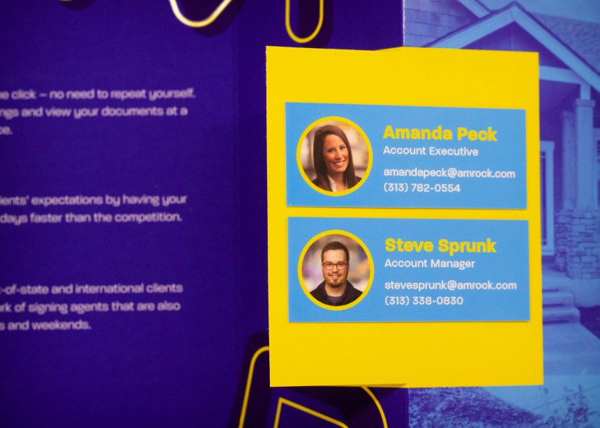
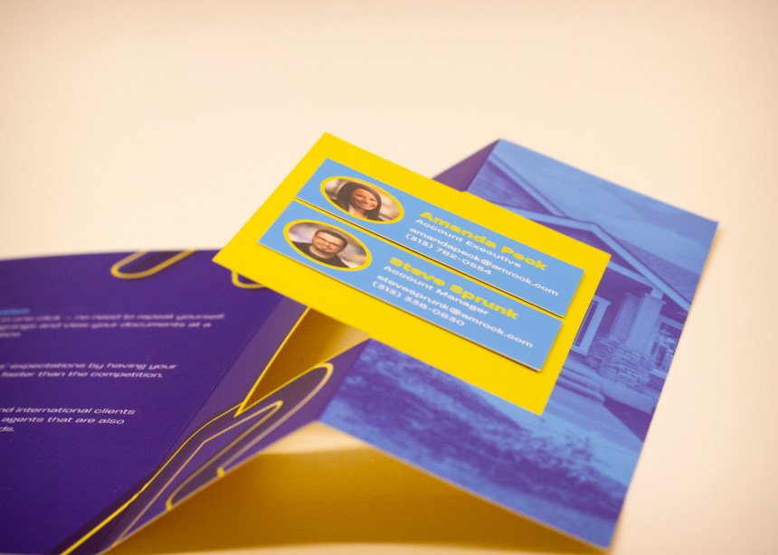
Lastly, we received some feedback in between print runs that we’d like to emphasize a single point of contact as a benefit. It wasn’t going to be possible to create a separate variant of the brochure for each AE on the team, so I looked into applying a patch. It’d be tricky to patch the brochure without it looking like we were trying to hide a mistake; after all, the contact info behind the patch was still correct, it’s just that it went to a general number and email box. My leader remembered that Moo offers a miniature size option for their business cards; I pulled some samples I had on hand, and sure enough, they’d fit. We’d order several hundred and apply them with glue dots.
Project copywriter: Devin Turner
Printer by Behrmann Printing
